Friday, June 21, 2013

Final exam piece.

  I have now completed all of my exam pieces. I have recreated the photographs that I have taken on my former page, using oil pastels and acrylic paint. Overall I believe that these pieces have been successful, I really like the bright colours I have used and how I have blended the oil pastels to create different colour effects. I also like the mutlicoloured parts where the ivy is on my pieces, by making this part the brightest it conveys its dominance over the man-made objects. My least favourite part of these pieces are the blocks of brown at the bottom of the pieces, I believe that I should of added more of a colour effect in order to add texture.
  Here is my final piece;


Exam preparation

   For my exam piece I have decided to do three different pieces, that could be displayed together. I have really been inspired by Fauvism and want to continue using the same style. I have decided to use oil pastels and thick paint for my pieces, as I have experimented most with that technique and believe that the method really works for my theme. I am going to display different sorts of man- made objects and display them with the nature around them being the most colourful. By doing this it conveys to my audience that nature is dominate and powerful and can take over and destroy man-made objects.
   As part of my exam prep I have collected three different photographs that I am going to use. The most dominate parts of the photographs are the ivy. The ivy is my artwork is going to be displayed as dominate.
  Here are the photographs that I have taken for my exam pieces;


Work inspired by Georges Rouault

     I have decided to create a piece with has been inspired by Georges Rouault I have really enjoyed his work and the bright colours that he uses in his work. In his pieces he always makes sure that they are extremely textured he does this by adding a large amount on paint and then adding oil pastels over the top. The piece that I have created is very colourful and also textured due to the use of oil pastels. I have drawn the gate in the middle and the plants around the outsides. This is to portray the  planetary to be over powering and dominate over the man made object. Therefore portraying my theme perfectly. I have been really impressed with this piece and I have decided that my final piece is going to be in this style. Although I am going to add thick paint aswell.


Artist Research:Georges Rouault

  Rouault trained with Matisse at Moreau's academy and exhibited with the Fauves, but his palette of colors and profound subject matter place him as an early, if isolated Expressionist. His work has been described as ``Fauvism with dark glasses''.He began his career apprenticed to a stained-glass worker, and his love of harsh, binding outlines containing a radiance of color gives poignancy to his paintings of whores and fools. He himself does not judge them, though the terrible compassion with which he shows his wretched figures makes a powerful impression.
  " Prostitute at Her Mirror" one of his most famous pieces,is a savage indictment of human cruelty. She is a travesty of feminity, although poverty drives her still to prink miserably before her mirror in the hope of work. Yet the picture does not depress, but holds out hope of redemption.
  Here are some of Rouault's art pieces:


Fauvism

    Fauvism was characterised by paintings that used intensely valid, non naturalistic and exuberant colours. The style was expressionist and generally featured landscapes in which forms were distorted. 
  The movement was subjected to more mockery and abuse as it developed, but began to gain respect when major art buyers such as, Stain took an interest. Leading artists involved Roualut and Andre Derain. Although the movement was short lived (1905-8). Fauvism was extremely influential in the evaluation of the 20th century art.
   Here are some examples of Fauvism artwork.


Here are some of the examples of the Fauvism that I have created:


Experimenting Oil Pastels.

   I have decided to continue working with oil pastels in  my work, as I believe that Oil pastel are the materials that I would like to use for my final piece. In my past pieces I have used darker colours in order to create a dramatic effect. I have decided to change my method and instead use lighter shades of oil pastels. I  have recently researched into Fauvism and have really been inspired by the work from artists such as Georges Rouvault. During the Fauvist period the work was mostly abstract and frequently used bright colours. I recently visited Skipton Castle, where I took photographs of the eroded castle and church. This first piece is taken from one of my primary photographs of the castle, but has been recreated in the style of Fauvism.


Tuesday, June 18, 2013

Oil pastel drawings (with backgrounds)

 As you can see from my last post I started to experiment with oil pastels. I wanted to continue experimenting with the same techniques  although this time I created backgrounds for the oil pastel drawings. The backgrounds have been created by using the dragging process. I used thick printing ink and dragged it using strong cardboard. When the dragged backgrounds dried I then started to add the oil pastels over the top. I used brightly coloured oil pastels in order to make sure that they looked eye catching and drew attention away from the backgrounds.
  Here are some experiments that I have tried out using different backgrounds.


Oil pastel drawings

   From researching the artist Patrick Caulfield I feel that his style of work could be something that I would like to continue with. I like the simple techniques he uses for example bold colours and black, bold outlines. I have experimented more with using oil pastels and copying some of my primary photographs  In the pieces below I have conveyed my theme of erosion extremely well. I have shown the nature as the dominate feature that overpowers the man made simplistic objects.
   Here are a few examples of the experimentation's I have created:


Work inspired by Patrick Caulfield.

   I have really been inspired by Patrick Caulfield's work and wanted to experiment more with his working styles and techniques. Caulfield used bold and bright colours in his paintings and print work. I have created a piece similar to his style. I completed an image transfer from one of my primary photographs which didn't turn out very well, due to the transfer ripping away from the material. I decided to be resourceful and try and turn it into the style of Caulfield. I drew over the transfer with oil pastels and added bright colours such as yellow,orange and green. The work looks simple with the bold colours and black outline but is still very effective and almost looks textured due to the use of oil pastels.
 Here is the piece that has been inspired by Caulfield's work:


Artist Research: Patrick Caulfield

  Patrick Caulfield is an English painter and printmaker. Caulfield's painting was characterised by flat images of objects paired with angular geometric devices or isolated against unmodulated areas of colour. Though commonly associated with Pop Art, he was insistent that he was not a part of the movement and developed a unique style of his own.His pieces are characterised by flat colour and simple outlines of everyday objects such as lamps and items of food.
   I have really been inspired by Patrick Caulfield's work I like how his drawings and prints are simple but yet are extremely eye catching.
    Here are a few examples of Patrick Caulfield's artwork:


  I decided to experiment by completing a copy of the two pieces above. I found the process relatively easy to copy, due to the artwork being yet simplistic. I comleted the copies by using paint and oil pastels for the outlines. Caulfield used think black outlines and so I have done the same with my copies.


Drag Paintings.

  I have created these pieces by dragging different colours of paint and dragged it with different sizes of cardboard that had been cut out. I firstly dragged the paint in order to make a background before putting the painting over the top of one of my primary images. When I had finished the drag paintings I found that due to the background being quite dark it was hard to see the painting that I had done over the top. To overcome this problem I used some bright coloured oil pastels to outline the painting. By outlining the image it has helped to make the painting look brighter and more textured.
  I enjoyed working with this method although found it hard to control the colours from blending, which lead to it making the image look extremely dark and dull.


Ink and bleach drawings

  As you can see from my previous pieces I have started to  experiment with ink. I really enjoyed working with ink and decided to further it by using a different technique. This time I added bleach to one of my ink drawings, when bleach is added with ink it creates a rustic, brown effect. 
  Here is the piece that I created with ink and bleach,


 I have outlined the eroied wall with black ink and then blended bleach in the middle of the bricks, in order to give my piece a mysterious and dramatic effect. I really like this piece and believe that if I continue to experiment with ink and bleach I will make the piece more detailed by adding more black ink in the middle of the bricks in order to express the erosion of the piece more.

Monday, June 17, 2013

Image Transfers.

   I tried out image transfers as part my coursework, they were really successful and therefore have decided to experiment more with image transfers.I used an A4 transfer size primary image that I collected myself.I then added a transfer in order for the transfer to print on my material. Once the transfer was complete, you then washed the paper off, which left you with your image transfer.This image was of an eroded building with a waterfall.
 This is the transfer that I created.

     After I completed the image transfer I decided to add a coloured wash over the top. I used the colours green and yellow in order to make it still look neutral. I am really glad that I added the colours as it improves the tone and textural of the piece. I really enjoyed creating this piece but I don't think that it is the method I want to use as part of my exam piece(S).

Ink Drawings.

    As part of my experiments, I have decided to use the method of inks. I have again been inspired by John Piper when I started to experiment with this method. John Piper's works produced using materials such as,different coloured oils and black chalk for the dark compositions. I haven't used ink much before in my work and I feel that it would be good to try something different as part of my exam work. Here is the first experiment that I created.

  
   In this piece again I have decided to make the nature around the man made rocks the most dominate feature. The plants around the rocks have been created using thick amounts of ink, making it the most dominate. I have also created an eroded effect by making the paint look like it has folded away from the bricks that are underneath the paint. I think that I am going to experiment more with ink, I think that I am going to add ink to different background or with bleach to make the piece look more dramatic.

Monday, June 3, 2013

Pencil Drawings.

   I felt that one of my strengths are pencil drawings and therefore I decided to experiment more with this technique. By looking at the artist John Piper and looking at his work of erosion and destroyed buildings, I felt inspired and that I should experiment with these methods further. Piper is most famous for using ink and shaded pencil drawings.I have also created some ink paintings that will be shown later on in my blog.
  This is the first piece that has been inspired by the artist John Piper. This piece has been created in my sketch book.


I feel that this piece has been extremely successful.I have created this piece using a simple pencil and shading the pencil in darker sections of the image. I have made sure that the plants and greenery areas are darker in order to make the nature look more dominate over the man made stone stairs. Even though I haven't added any colour it is still really effective. The plants are dominate and dramatic to convey that they have the power over  everything else.

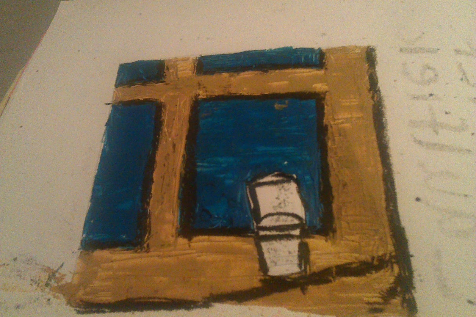
    The second pencil drawing that I have created is another one from my primary photograph. I really like this pencil drawing as it conveys the theme of erosion. I have concentrated on the eroded paint from a wall, which I took as part of my primary photographs. I believe that if I concentrate on this image again I will add colour to it. I think that it would of been more successful if I would of added a bit of black ink in order to increase the effect which John Piper did in his own artwork.


Work inspired by Nicolette Benjamin Black

  I have been inspired by Black's work. I am interested in her use of recycled materials and making scrap materials into a piece of artwork. One of Black's pieces had been created from recycled tea bags that had been thrown away. She then made a collage of the teabags in order to create a eroded brick wall. I have created my own piece that has been inspired by Blacks work. In this piece I have used scrap materials and made them into a piece of art. This piece shows a man-made pond that has become overcrowded with nature. For the plants I have used string, felt and pieces of cardboard, as well as paint to add colour. By adding this sort of material it adds texture to the piece.


Artist research: Nicolette Benjamin Black

  Black uses waste materials in her work, as she re imagines these discarded materials in new ways in her images, integrating them into natural landscapes. She expresses that useless items can be creatively used in artwork for example, teabags or electric cables. Black successfully blends figurative with abstract. Colour is sometimes used and introduced with the neutral backgrounds. This leads to a sense of holistic order and balance to the overall composition. 
 Black has really inspired me with her work, I like the idea that she uses "useless" materials in order to make fantastic pieces, such as the ones below. The image below has been made from recycled teabags  Through using objects such as that and painting over them, gives them a great amount of texture.


 Here is one of the copies I have created of Black's work 


I have created this piece by cutting up various materials such as, cardboard and felt in order to create different textures. After I had stuck down all of the pieces I we over with a mixture of red, white and brown paint, in order to give it a rustic, old look.Due to Blacks work being created from teabags I found it hard to complete it using the same method. Although the method is different I still made this piece from recycled materials, that have been made into something a lot more creative.


Artist Research: John Piper

 I have chosen to research is John Piper. John Piper is a painter of architecture,landscape and abstract compositions. This artwork has been produced using materials such as,different coloured oils and black chalk for the dark compositions  His artwork has been based on landscape and eroded buildings and has inspired me to base some of my artwork on his style of art, as the work relates to my chosen theme and I would like to have a go at using coloured ink as it not a usual material that I woul
d use in my
 work.
Here are some examples of what John Pipers work entails;
33979

Piper1

Piper-CwmGraianog
I have created my own version of John Pipers work, I have done this by uses different colours of ink which is similar to what John Piper uses in his own work. John Pipers style of work has inspired me to start using ink in my own work which I haven't tried before.
Here are my pieces of work that have been inspired by John Piper;


This image is of a church that has eroded over time. Piper was interested in old buildings and therefore is the prefect artist to look at for my theme of nature meeting buildings.

Work inspired by Helene Brennan.

Helene focuses her work on the erosion of buildings from places that she visits.She enjoys exploring the change of buildings over time through landscape and erosion. She is interested in the light and colours of the buildings,sea and sky, as well as the moods and the forces of nature on man made objects.
  Here I have created a piece of art that have been inspired by the artist, Helene Brennan. I completed this piece of art in my book, focusing on the colour and light of which Brennan also focuses on. 
    I have tried to shade the parts that have eroded away from the door. This is a painting from one of my primary photographs of a back gate that is old and has been destroyed by the nature. Brennan focuses on how places change over time and how the environment can change made man objects. I believe that by using a large amount of paint around the eroded area adds texture to the piece.


     I have also created another piece that has been inspired by  Helene Brennan. In this piece I have focused on the colour and the light contrasts of the eroded door.This piece has been created using watercolours, using colours such as, red, yellow and greens. I have also outlined the piece with a black Biro pen in order to give the piece structure  Brennan's pieces always look realistic as she concentrates on the landscape she knows well and can therefore add a lot more detail to her pieces. I have taken this from one of my primary images and have made should that I pick of the important features of the image and add them to my own pieces.


Artist Research: Helene Brennan

  Brennan was inspired by her travels to the countryside in Briton and also other countries. The forms and the colours of the environment are different everyday due to the changes in environment for example, decay. She enjoys exploring the change of buildings through erosion and landscape also.
  Brennan is interested in expressing the light and colours of the land,sea and sky as well as the moods and the forces of nature.She calls it the "power of nature". I really love her work due to it almost looking like a realist scene,of where she has been.

As you can see from this painting Brennan focuses on erosion, which is also what I am interested in. I like the realistic look to her work and the texture of her painting make it extremely eye- catching.

 Here are some of the copies I have created from Helene Brennan's work.


I have tried to do a copy of Brennan's work although I don't think it has turned out very well. I think I needed to add more detail it the the ruined buildings in order to make it look more realistic like it is in the original painting. 

Work inspired by Marcus Payzant

From researching Marcus Payzant I have created my own style from using my own primary photographs. The piece below has been created using coloured chalk pastels for example colours such as, browns and greens. Payzant uses bold blocks of colours which can be compared to my inspired piece. I have used bold colours of reds and greens which have then been outlined with brown chalk. The only problem with this piece is that it lacks bright colours. Payzant uses bright colours in order to make it look eye catching, but this piece looks dull and could be seen as a bit bland. I am going to make sure that if I experiment more with chalk I am going to add brighter colours .

Artist research: Marcus Payzant.

 The first artist I have chosen to research is Marcus Payzant. Payzant is inspired by nature and forces involved in very day life for example, living and non living objects. He also focuses on decay as his catalyst, I am focusing on decay and erosion and therefore Payzant has inspired me with his brilliant ideas. Payzants paintings and drawings are a mixture between landscape and still life. He uses bold colour choices that bring the viewer into the paintings. He mixes compositions of common and usual objects in an environment that could be real or a dream. I have been heavily inspired by Payzant, I really like the way he takes everyday objects and changes them in to unusual settings.

Here are some examples of Marcus Payzants work:


Here are some of the copies I have done of his artwork, the copies have been created by using,coloured chalk and paint. I am really happy with how the two piece have turned out as they almost look identical to Payzant's pieces. I am going to experiment more with this style of work later on when I collect my primary photographs.